Page 3 of 20
Posted: Tue Nov 09, 2004 3:14 am
by j$
tviyh wrote:i think the giant "do not push" button encapsulates the title so perfectly!
we've had some pretty amazing artwork a lot of times, but as cover art relating to the title, this is about as good as we could ask for. WTG bortwein.
I just dropped by to say the very same thing. Cracking.
j$
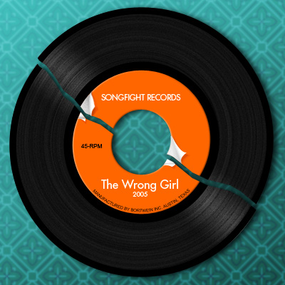
Posted: Tue Jan 18, 2005 9:36 pm
by bortwein
It's been a while since I've gotten any feed back. No Biggy.
I just wanted to say that I learned how to make a 45 in photoshop recently so that's where the idea came from. I was going for the idea that "the wrong girl" or girlfriend that breaks all your 45s when you break up with her.

Posted: Tue Jan 18, 2005 11:38 pm
by mkilly
bortwein wrote:It's been a while since I've gotten any feed back. No Biggy.
I just wanted to say that I learned how to make a 45 in photoshop recently so that's where the idea came from. I was going for the idea that "the wrong girl" or girlfriend that breaks all your 45s when you break up with her.
It's very clever and I like it a lot. That message is a little opaque, though.
Posted: Wed Jan 19, 2005 12:45 am
by drë
bortwein wrote:It's been a while since I've gotten any feed back. No Biggy.
I just wanted to say that I learned how to make a 45 in photoshop recently so that's where the idea came from. I was going for the idea that "the wrong girl" or girlfriend that breaks all your 45s when you break up with her.
man, that’s a BORTWEIN CLASSIC.
the preview pic in the front page, is not too captivating, mostly cause 99% of the people would know that’s a record... so it leaves little to the imagination. but the full art, is very nice. the combination of gloss black, orange, and that gradient green, is brilliant. The only thing that could be missing is a bit of fabric texture on the green background to give it table cloth feel to it. At first I though that was wallpaper, but then why would a broken record be glue to the wall?
edit: also adding wrinkles to the table cloth, would add more life like feel to it.
Posted: Mon Jan 24, 2005 2:10 pm
by Rabid Garfunkel
Errr, Bort', do you ever look at your art submission and think Goddamn, if I'd only done X, that might've worked better for the pic?
'Cause right now I'm wishing I'd hit the falling guy with a select->choke->feather before applying the motion blur. Looks too much like a drop shadow, currently.
Also, are you working @ size (400pi x 400pi) initially?
Neophytically yours,
RG
Posted: Tue Jan 25, 2005 11:54 am
by jack
so bortwein.....i was looking at this week's ninja cover, thinking "wow, what a boring ass cover from bortwein, he must have taken the week off and phoned it in this week. i mean, the type treatment is cool and all but you've set the bar high for youself. then i notice the tiled background is some sort of mask. THEN i notice one of the random masks has his eye's open. and i think man, that bortwein is pretty friggin brilliant.
Posted: Tue Jan 25, 2005 3:42 pm
by bortwein
Rabid Garfunkel wrote:Errr, Bort', do you ever look at your art submission and think Goddamn, if I'd only done X, that might've worked better for the pic?
'Cause right now I'm wishing I'd hit the falling guy with a select->choke->feather before applying the motion blur. Looks too much like a drop shadow, currently.
Also, are you working @ size (400pi x 400pi) initially?
Neophytically yours,
RG
Do I every look back at a cover and think I could have done something better or differently? Hell Yeah. Almost all the time.
The falling guy: yeah looks like a drop shadow. Usually when I want to do a motion blur effect on an object or something I usually use 2 layers of the item. Copy one to keep it clean then I motion blur the other to an amount that looks good then I over lap the 2 images with the blur moved to the back of the first image to give the sharp front look with the blurry motion back.
400x400: Yup. I usually work from the biggest down to the smallest size while making covers.
jack shite wrote:so bortwein.....i was looking at this week's ninja cover, thinking "wow, what a boring ass cover from bortwein, he must have taken the week off and phoned it in this week. i mean, the type treatment is cool and all but you've set the bar high for youself. then i notice the tiled background is some sort of mask. THEN i notice one of the random masks has his eye's open. and i think man, that bortwein is pretty friggin brilliant.
Honestly if I felt like I could have called in for this one I would have: not because I didn't think I could make a good cover, but becasue I was sick all weekend and all week before I was redesigning a website for Money.
The tiled ninja guys was kind of a fall back due to time. I made that cover in about 2 hours the afternoon of Monday. I was already late and I spent at least one of those hours trying to find an idea for how to make a good image for the cover, the rest of the hour was making what you see now.
And I agree I have set my bar pretty high in the past, but to be honest I'm not always going to be able to clear it.
Thanks,
Posted: Tue Jan 25, 2005 10:41 pm
by Rabid Garfunkel
bortwein wrote:Do I every look back at a cover and think I could have done something better or differently? Hell Yeah. Almost all the time.
The falling guy: yeah looks like a drop shadow. Usually when I want to do a motion blur effect on an object or something I usually use 2 layers of the item. Copy one to keep it clean then I motion blur the other to an amount that looks good then I over lap the 2 images with the blur moved to the back of the first image to give the sharp front look with the blurry motion back.
400x400: Yup. I usually work from the biggest down to the smallest size while making covers.
Good to hear. And thanks for the advice, I was close, but had to overcome some poor layer masking on the source for the falling guy. Good to learn new hacks!
Posted: Tue Jan 25, 2005 11:22 pm
by Plat
My first reaction to the Ninja Gang cover art was to gaze into it like a Stereogram. Didn't get magic 3D vision, but it did make the open-eyed ninja stand out.
Hoping I'm not the only one.
Posted: Wed Jan 26, 2005 6:17 pm
by HeuristicsInc
No, but I did after I read this, and his eyes glower in a weird ninja way when you do that. Cool.
The logo is distracting when you do that, though.
-bill
Posted: Wed Jan 26, 2005 6:51 pm
by Me$$iah
AAAAAAAAAAAGGGGGGGGGGGGGRRRRRRRRRRRRHHHHHHHHHHH
STOP IT STOP IT GO AWAY
HES LOOKING AT ME
STARING ....................................STOP IT
MAKE HIM STOP
Im gonna cry now
wawwaaaawawwawaawaohohohbbbbbobbh!!!!!!
serioulsly I dig the ninja army
Ninjas Fousands of em
Dont shoot till you see the whites of their eyes
Posted: Sat Jan 29, 2005 11:33 am
by Eric Y.
Posted: Mon Jan 31, 2005 4:45 pm
by mkilly
when it snowed's pretty good. I was trying to make something for it (as I recently acquired Adobe Illustrator) but I've forgotten how to use Adobe Illustrator. I like the type on "when it snowed" and the subtle snowblower blowing snow to create it.
Posted: Mon Jan 31, 2005 4:56 pm
by jack
yeah bortwein. another great cover man.
Posted: Mon Jan 31, 2005 5:42 pm
by Phil. Redmon.
Agree, super great When it Snow'd art. B'ort, you are a great.
Posted: Mon Jan 31, 2005 10:09 pm
by Rabid Garfunkel
Bort, as always, tasty and compelling (even more so for the bit-style minimalism that you do so well).
And kudos to Gemini6Ice for his Glass Eye. Maybe I'll take you next week, homey... not that I have any ideas yet, but hey [insert PJ's fist ascii art here].
Posted: Fri Feb 04, 2005 1:45 am
by Freddielove
The cover for "When it Snowed" is one of the best in a long time. Great Idea.
Posted: Mon Feb 07, 2005 11:36 pm
by mkilly
prayformojo, a graduate! it paid off.
great job, bort.
Posted: Mon Feb 07, 2005 11:40 pm
by Rabid Garfunkel
Errr... process colors then, is it? So, which color's Bort's, eh?
[edit] Just saw the updated front page, and he's yellow. Bort. Yellow. Check. [/edit]
Posted: Tue Feb 08, 2005 12:01 am
by john m
Boing.
The Truth cover is nifty. But I don't get it. If there's anything to be got.
Posted: Tue Feb 08, 2005 8:16 am
by Mac
Nothing to be got.. so seems you got it.
hollywood fantasy
Posted: Wed Feb 09, 2005 1:40 am
by Tawny
With four fights to choose from, I really couldn't stay away this week.

I'm gonna work up something artsy for Hollywood Fantasy!
